
My Work
Peregrine Coffee Roasters
Client Work
Overview
Objective: To create simple, effective branding for a new coffee roasting business. As well as designing coffee packaging labels for a pop-up to introduce the business to their community.
Tone: Organic, Minimalist with pop of colour, imperfect shapes, earthy colour palette
Primary Audience: Coffee lovers and the casual coffee drinker who want to learn more about coffee
Deliverables: Logo and Coffee Packaging Labels
My Role: Graphic Designer

About Peregrine Coffee Roasters
Story: The owner loves all things coffee and previously had a coffee roasting business before moving to Korea. They recently decided to start the journey of making a new roasting business.
Why Peregrine? The owner was inspired by the Peregrine Falcon, the way the birds soar through the wind. Peregrine also means traveler or foreigner.
Tagline: “A tendency to wander”

My Process
Sketches & Concepts
After brainstorming with the owner, I started with some rough sketching
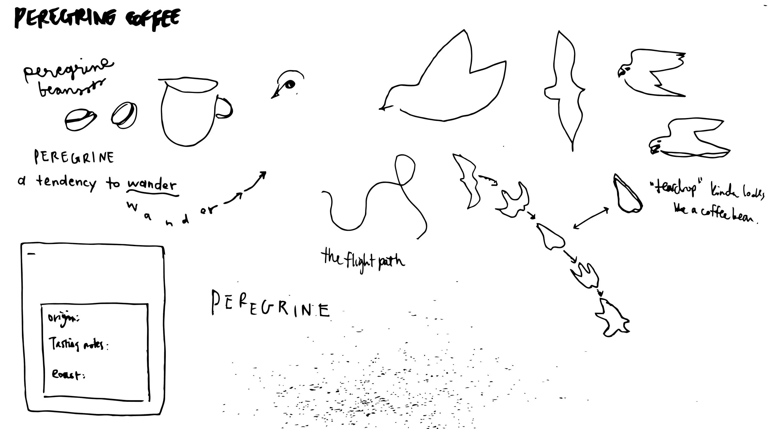
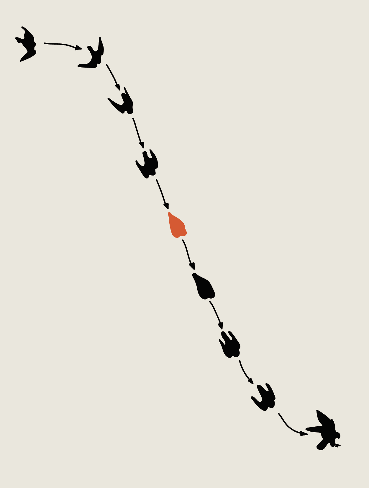
I started exploring the bird’s flight path, specifically this shape in the middle that looked similar to a coffee bean
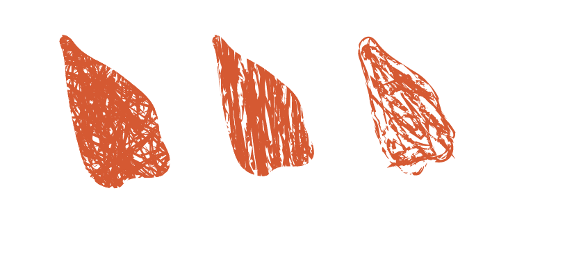
To match the organic, imperfect tone that the owner wanted, I experimented with different textures

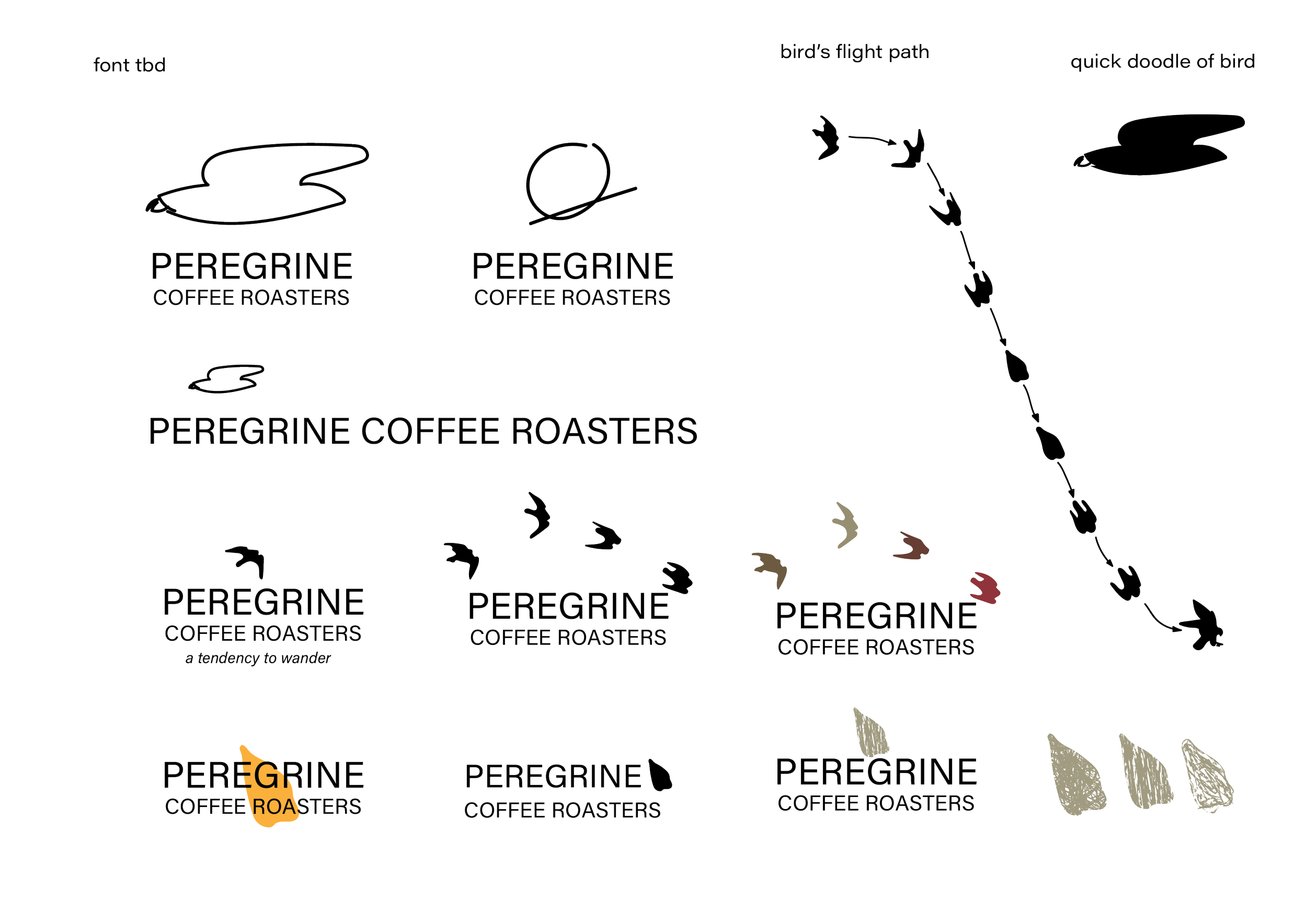
Typography
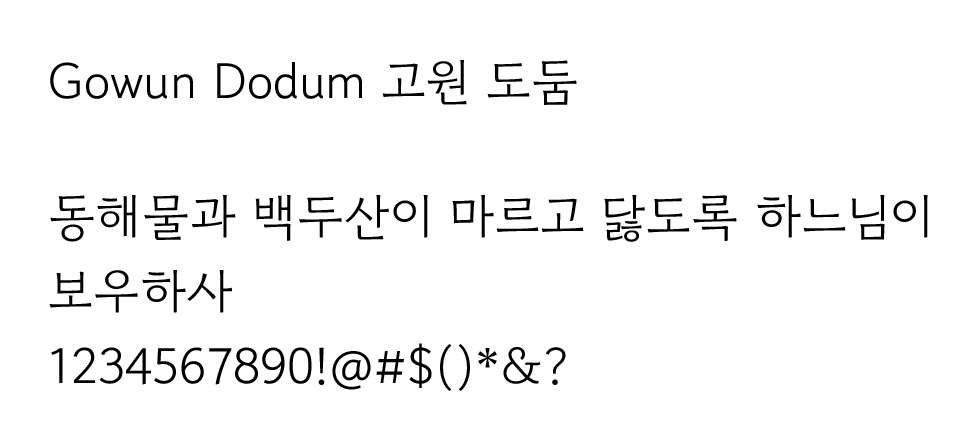
Futura is sans serif typeface that is simple, modern and easy to read. The bold lines suit the minimalist look of the brand.
Gowun Dodum is a Korean typeface that adds warmth to the brand, it is sophisticated and simple.
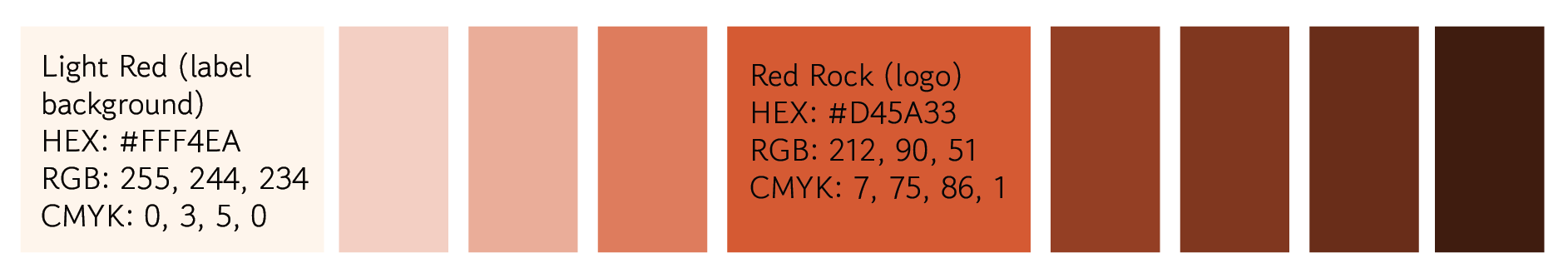
Colour
The owner is an avid rock climber and wanted to incorporate the earthy red colour of the rock in places like Wadi Rum and Red Rocks.
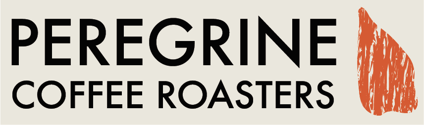
Final Design: Logo
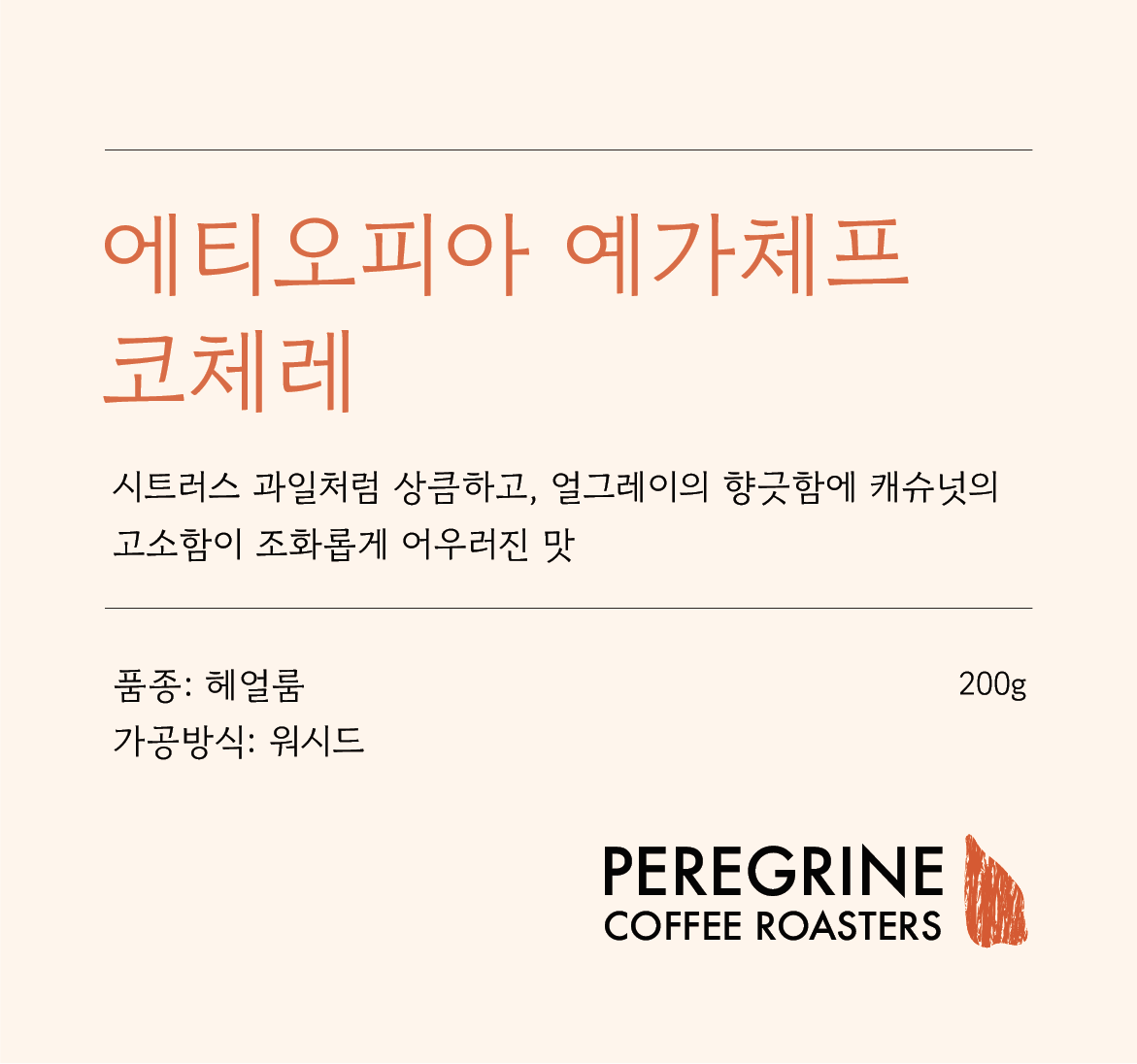
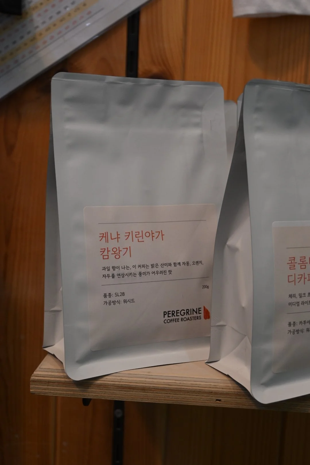
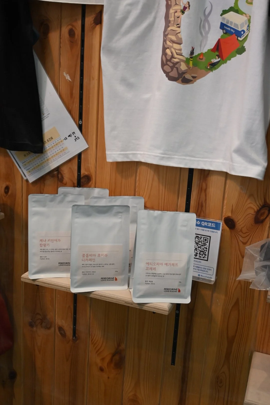
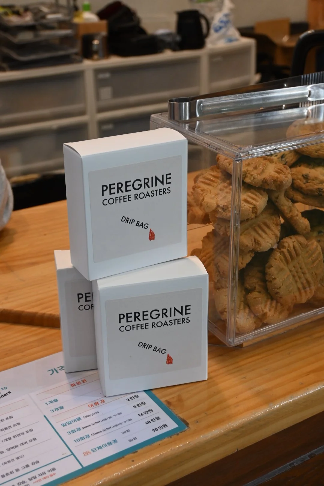
Final Design: Coffee Bag Label
Coffee Pop-up: Peregrine Coffee Roasters x Seoul Boulders
Jan . 24 . 2026
… and more to come!