
My Work
Museum of Vancouver (MOV) Annual Report
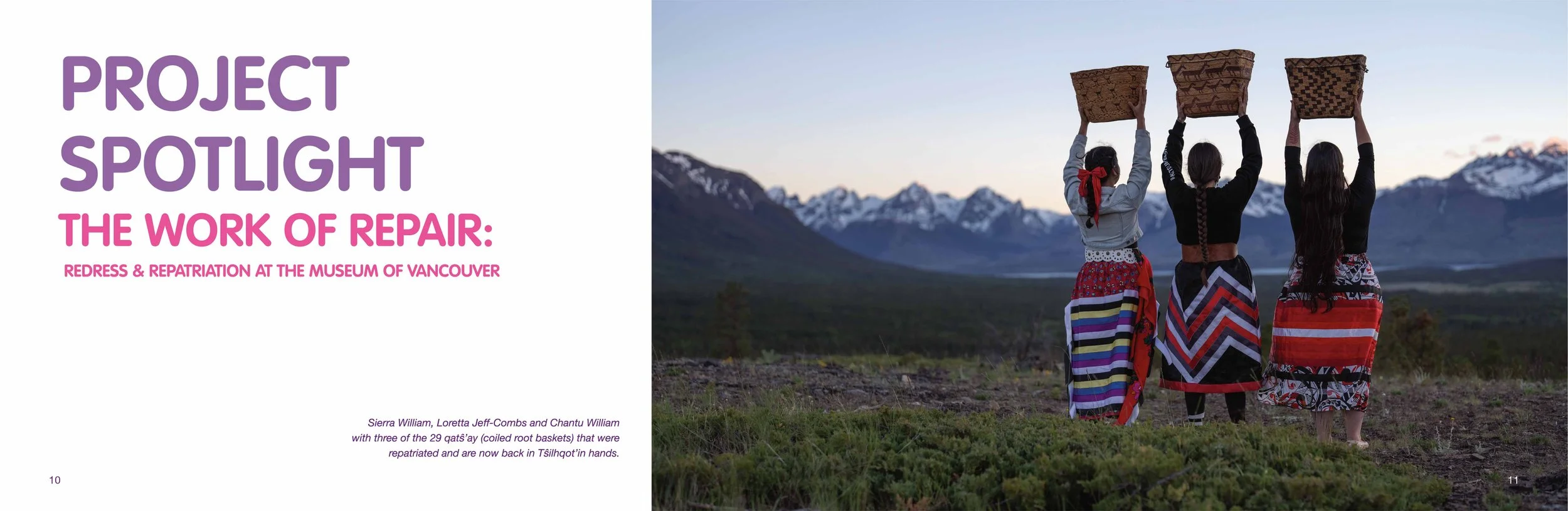
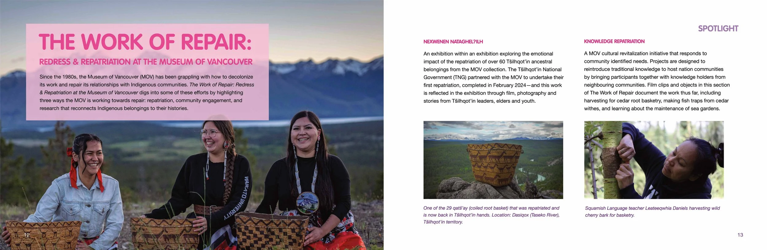
Student Project
Starting with thorough research all the way to an Annual Report, using MOV’s brand guidelines I created a theme for the year with touch points including a banner map and social media posts.
Overview
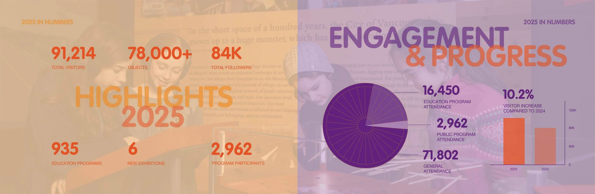
Objective: A review of the successful past year for MOV. Highlighting the increase in visitor attendance, community engagement and earned revenues. This report should communicate all the exhibitions and programs created and the local community’s engagement and attendance as well as all key financial information.
Tone: positive, hopeful, grounded, approachable
Primary Audience: Current stakeholders, investors and donors. Also viewed internally and by prospective investors and donors. Media may be a tertiary audience
Deliverables: Limited print run and a digital version that will be available via website
My role: Graphic designer
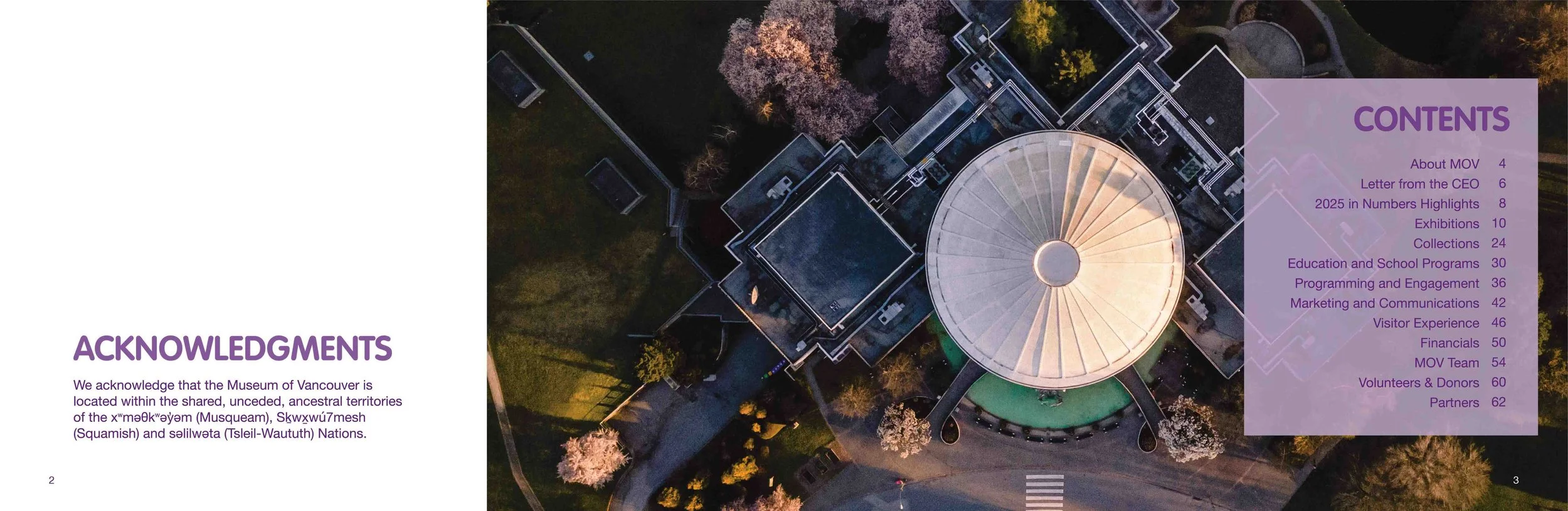
About MOV
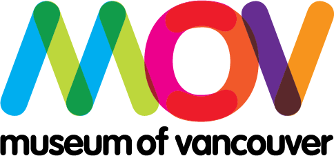
MOV’s main logo:
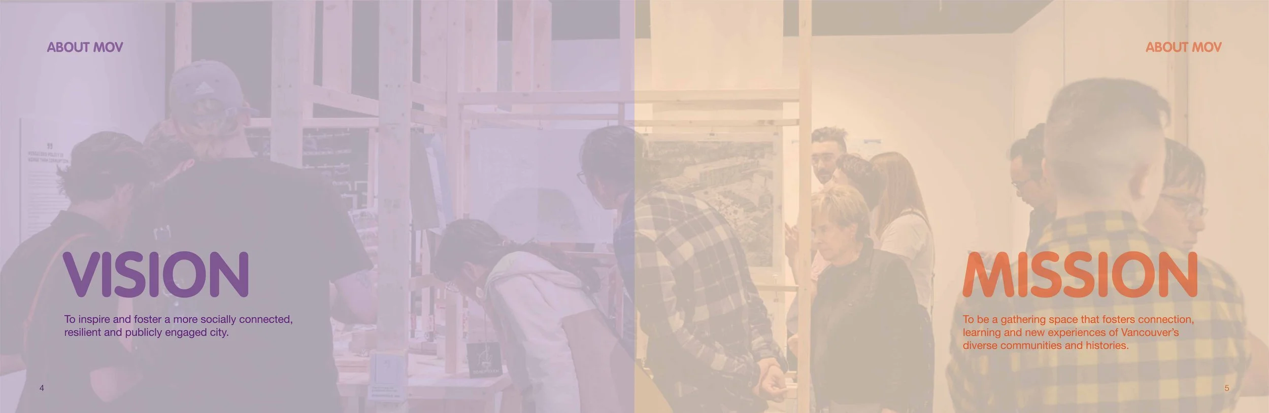
The Museum of Vancouver (MOV) connects Vancouverites to each other and connects the city to the world. An enthusiastic civic advocate, MOV is dedicated to encouraging a deeper understanding of Vancouver through stories, objects and shared experiences.
Tagline: “Vancouver’s Story Begins Here”
My Process
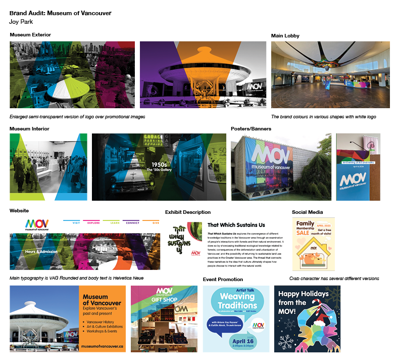
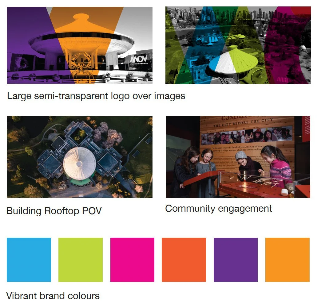
Visual Brand Audit
A review of the brand’s visual elements to ensure effectiveness and alignment with brand’s overall identity and goals.
I went for a mood board brand audit, collecting all visual aspects of MOV for research.
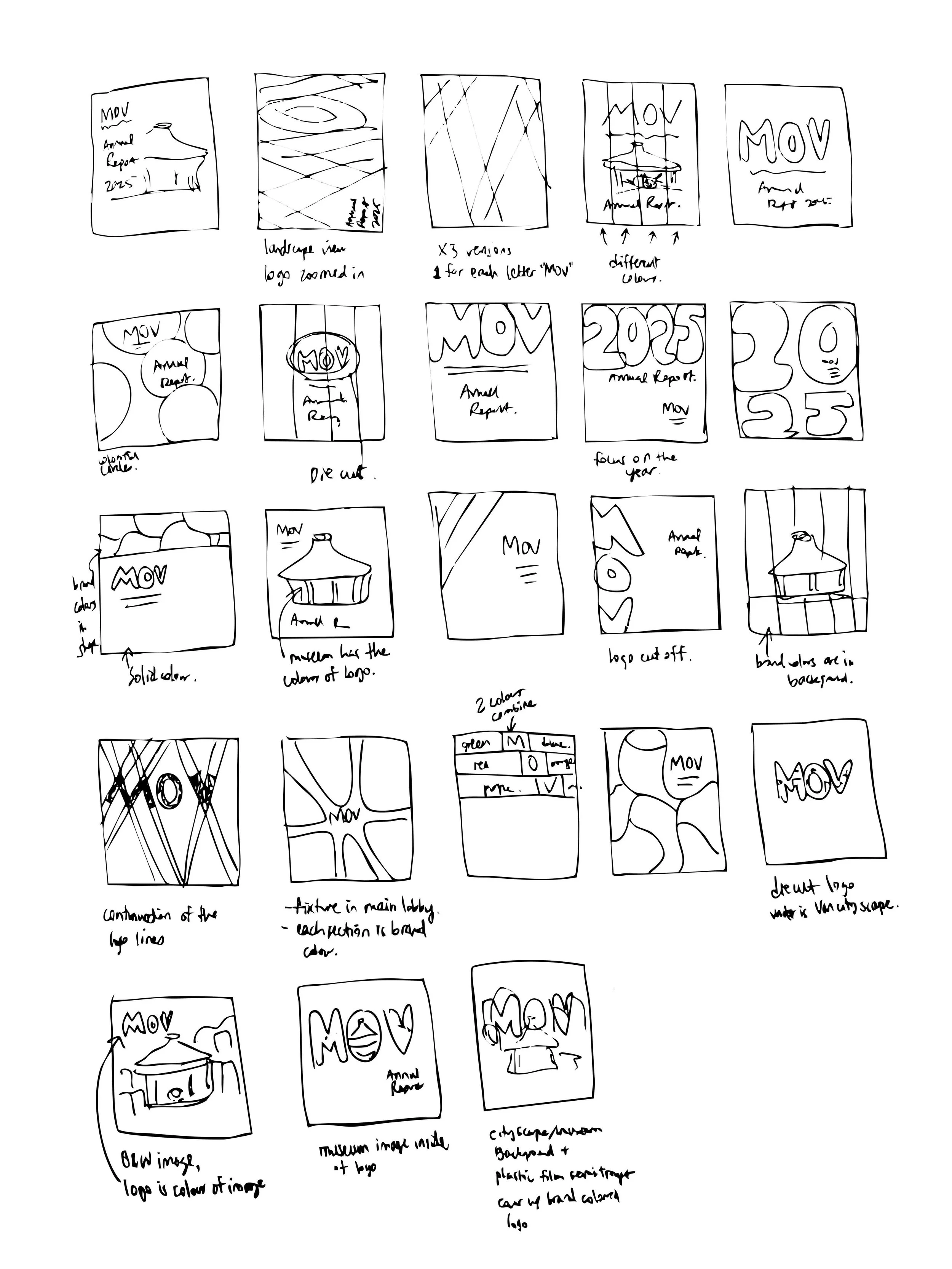
Sketches & Concepts
Through research and sketching, 3 concepts were proposed.
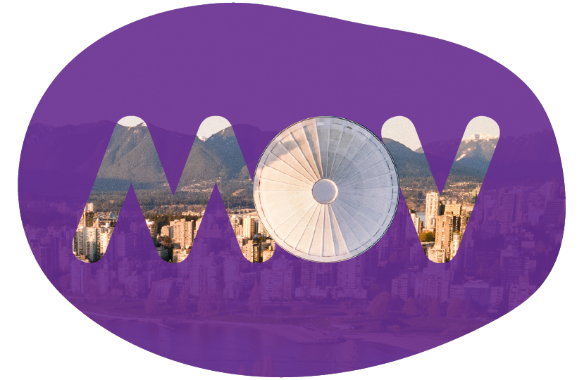
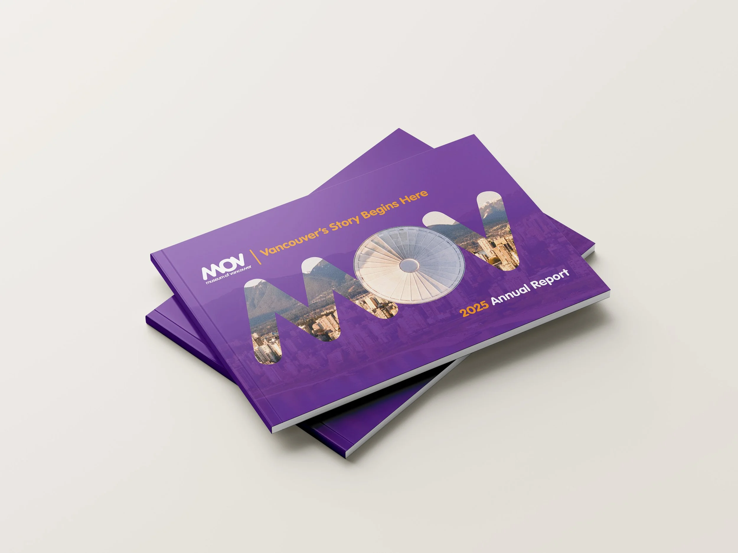
Final Design: Cover Page
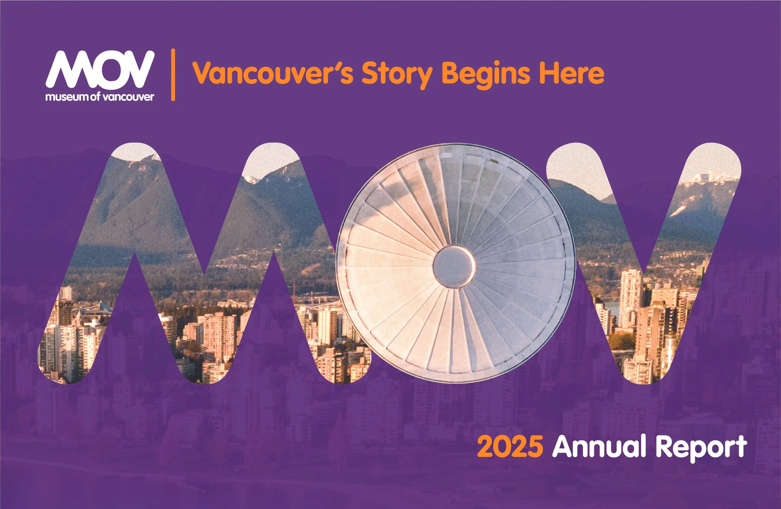
The chosen concept’s cover has the semi-transparent background with the cityscape encased in the logo, it shows how MOV brings vibrancy to the city’s history and creates new opportunities to experience Vancouver’s diverse community. Notice the “O” in MOV is the building rooftop, this is an element I use throughout the report, making a memorable icon and bringing some fun to the project.
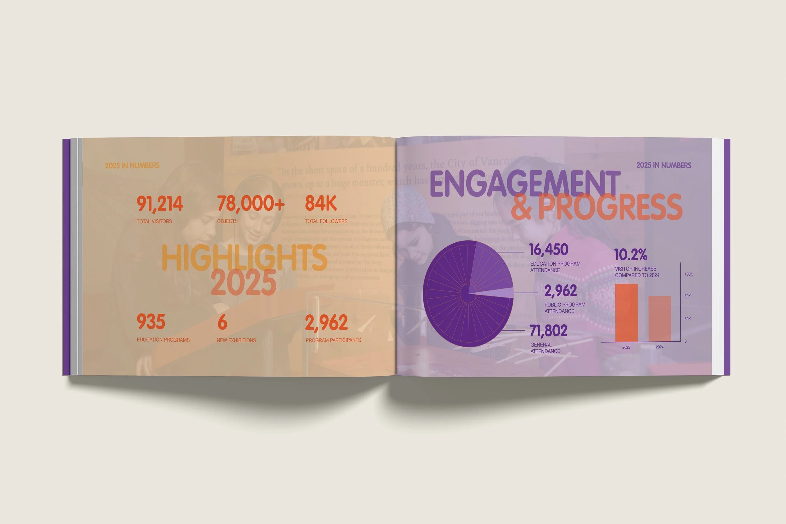
Final Design: Spreads
Collateral
I continued to explore this visual identity by creating collateral that followed the same concept.
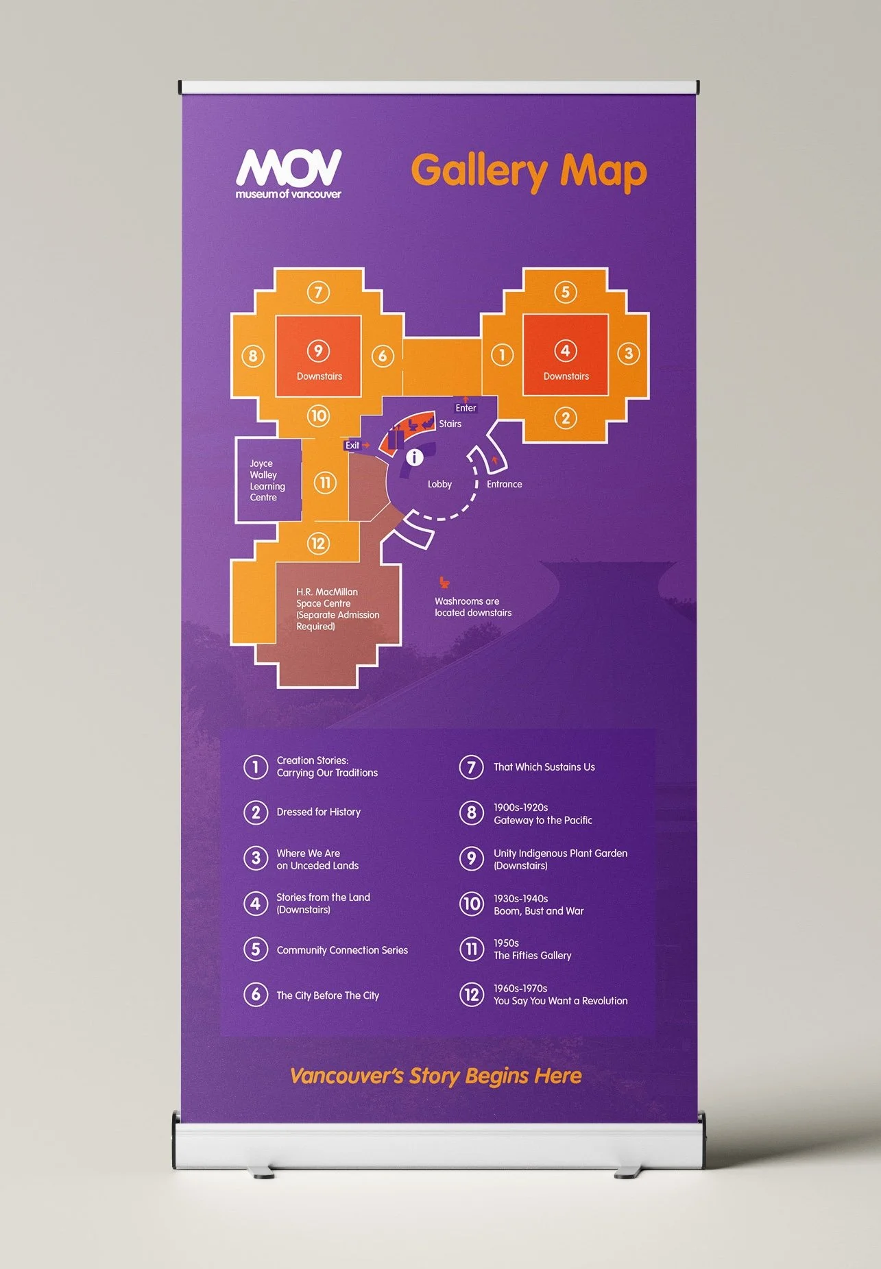
Gallery Map Banner
Employee Badges
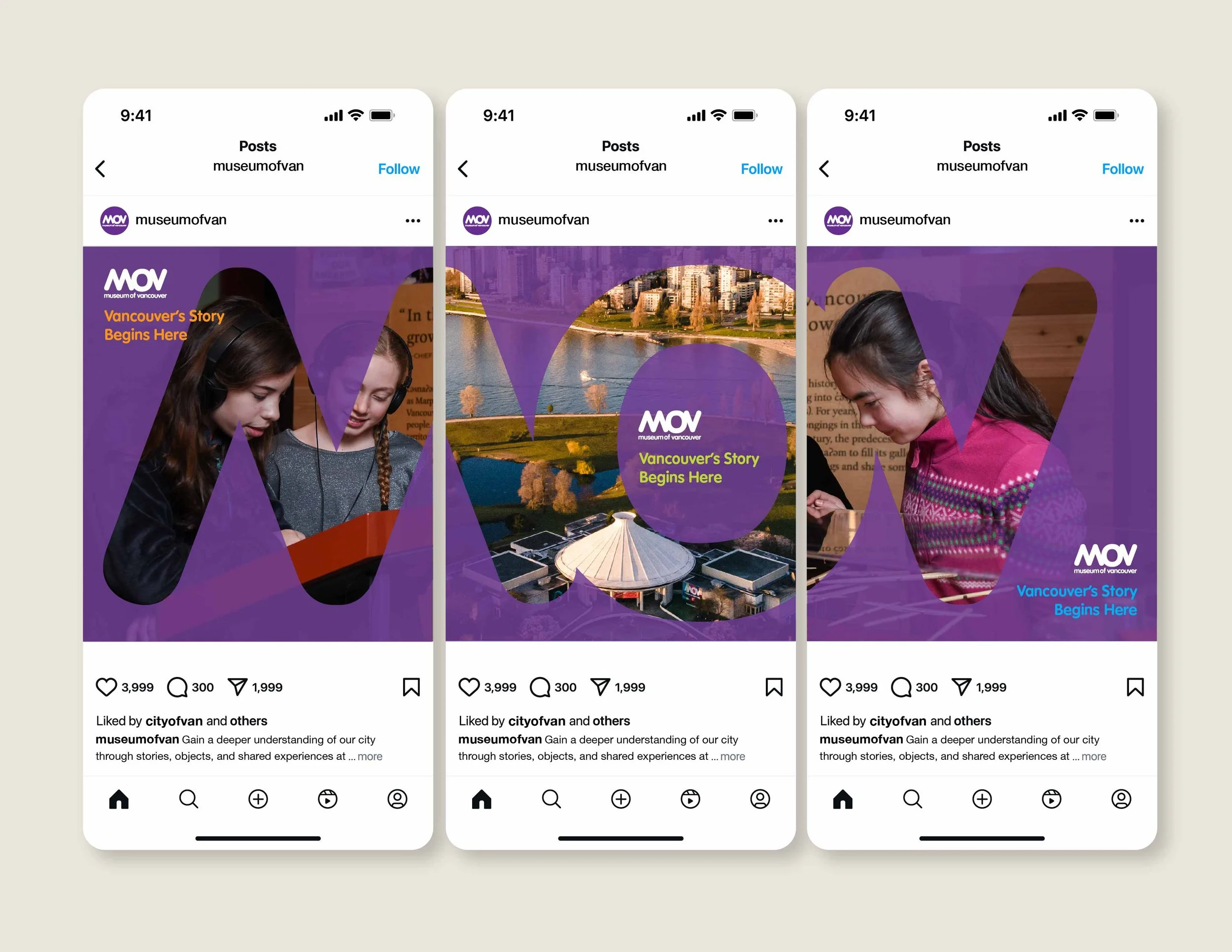
Social Media
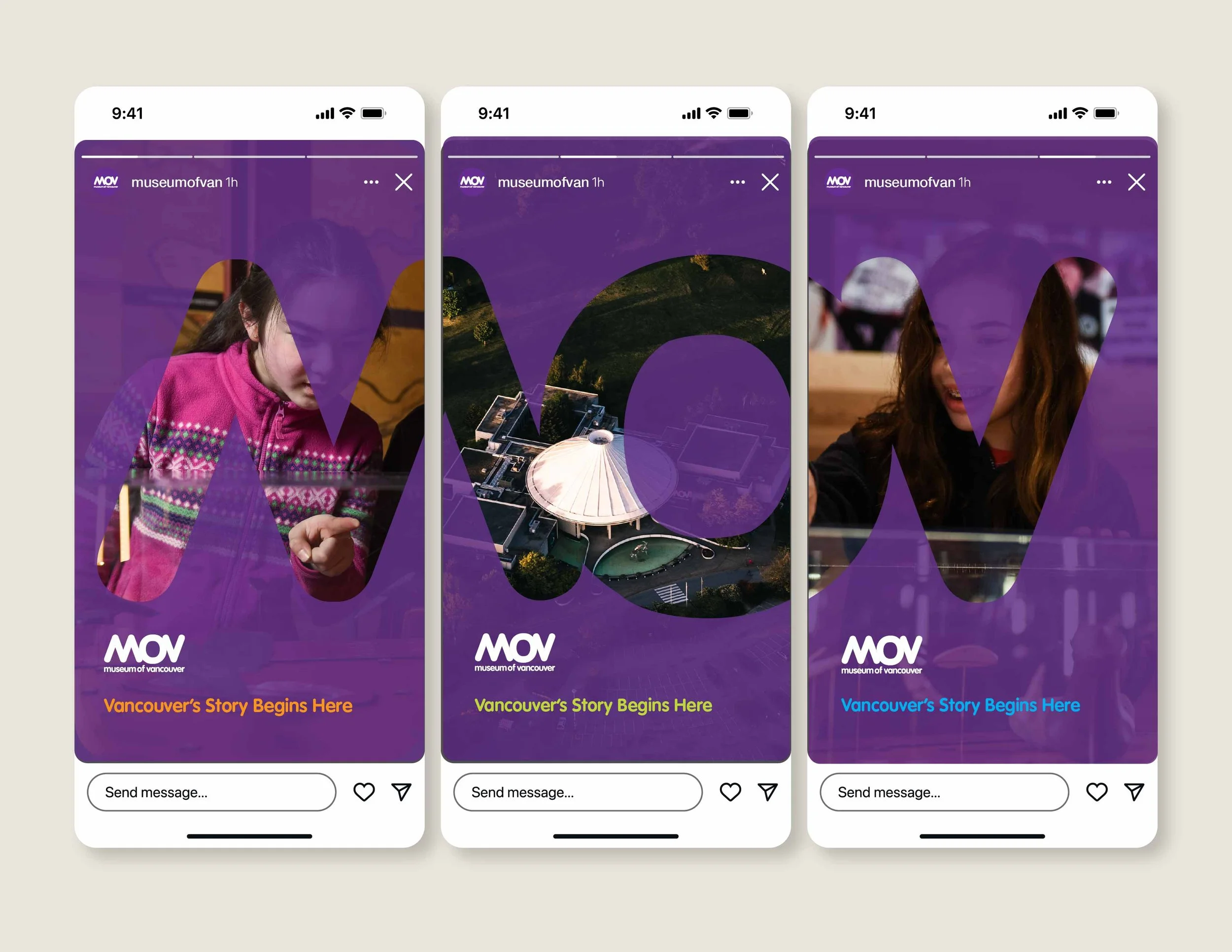
Platform: Instagram
Audience: Vancouver locals, visitors and donors
Message: Come visit MOV! & Vancouver’s Story Begins Here
3-in-1 posts/stories that connect to make the letters “MOV”. Each post separately still promotes the museum and brand
Reflection
Creating a consistent visual identity for this report came with new challenges I was excited to experiment with. I wanted it to be unique but still follow the brand’s overall look. MOV’s vibrant colour palette was exciting to work with but also came with a lot of brainstorming to find a good balance of colours. The solution I found was focusing on key colours to anchor the theme and using the others as highlights and categories.
This was a fun project that I learned a lot from and broadened my design skills and interests in print design and branding.